Wrenbird Design
WorkLet’s talk

Ward on Wine

Syncopation Wine Label Design

A rhythmic label and logotype for an unexpected red-and-white blend.
Syncopation Wine Label Design

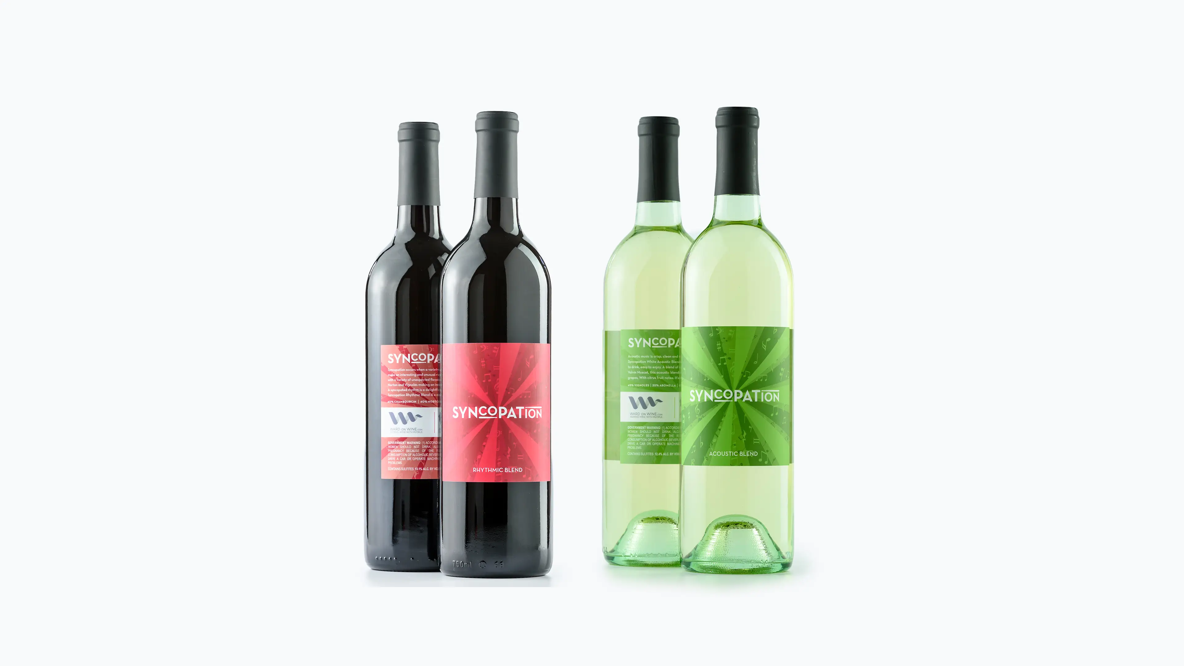
In music, syncopation happens when unexpected beats combine into an unusual rhythm. Syncopation wine does the same with an unexpected blend of red and white grapes. We worked with Mike Ward of Ward on Wine on the labels and the Syncopation logotype.

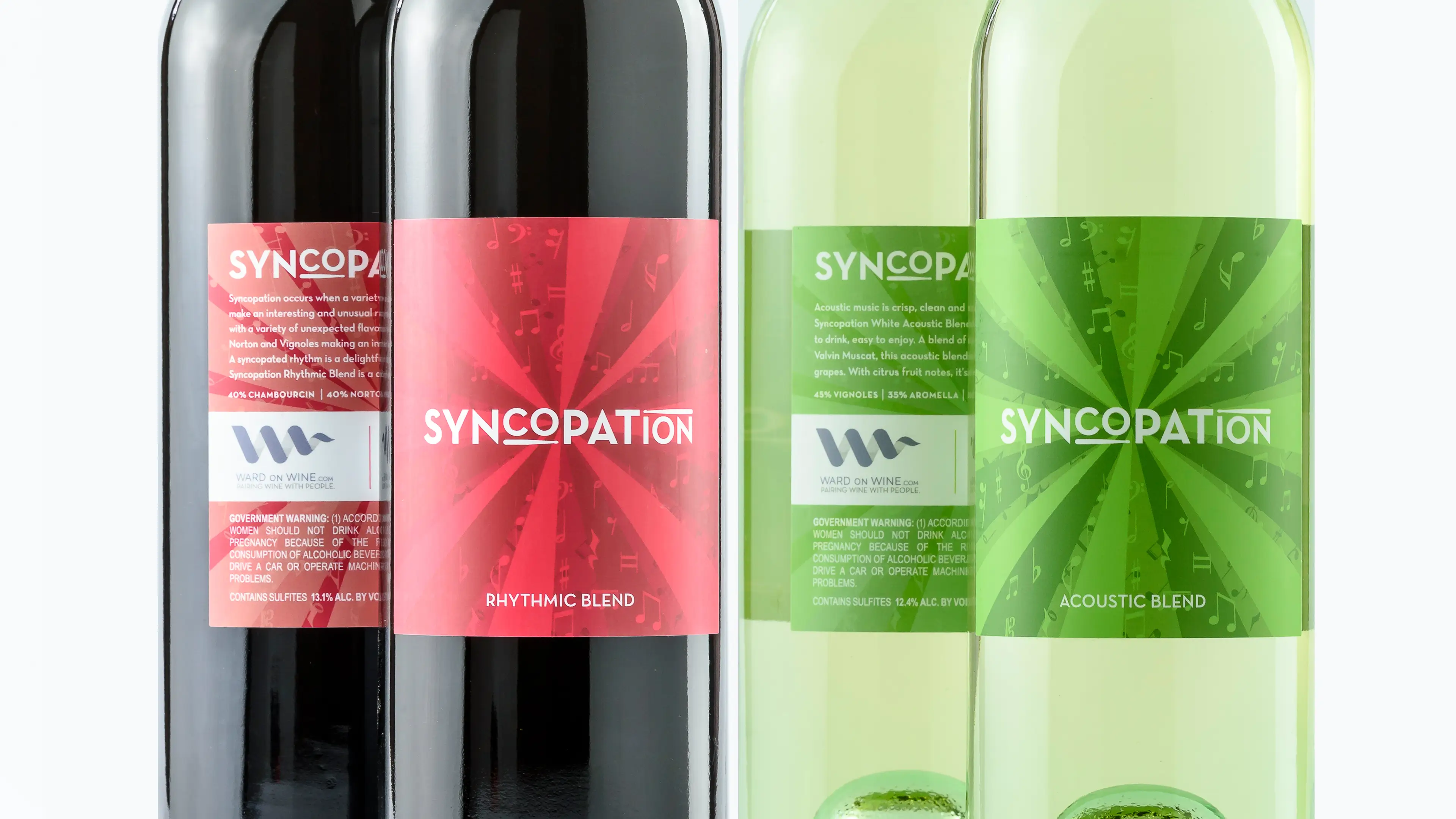
Bright rays of color give the labels their rhythm, and a storm of musical notation dances between them.
Syncopation wine bottles, two reds with a pink starburst label and two whites with a green starburst label
Close view of the Syncopation labels, with the logotype over rays of color and scattered musical notes, in pink for Rhythmic Blend and green for Acoustic Blend
No items found.

Project team

Britni Eggers, Karl Eggers

Nancy Winkelmann (photography)

All work