
A neon-inspired identity for a downtown St. Louis taco and tequila restaurant.
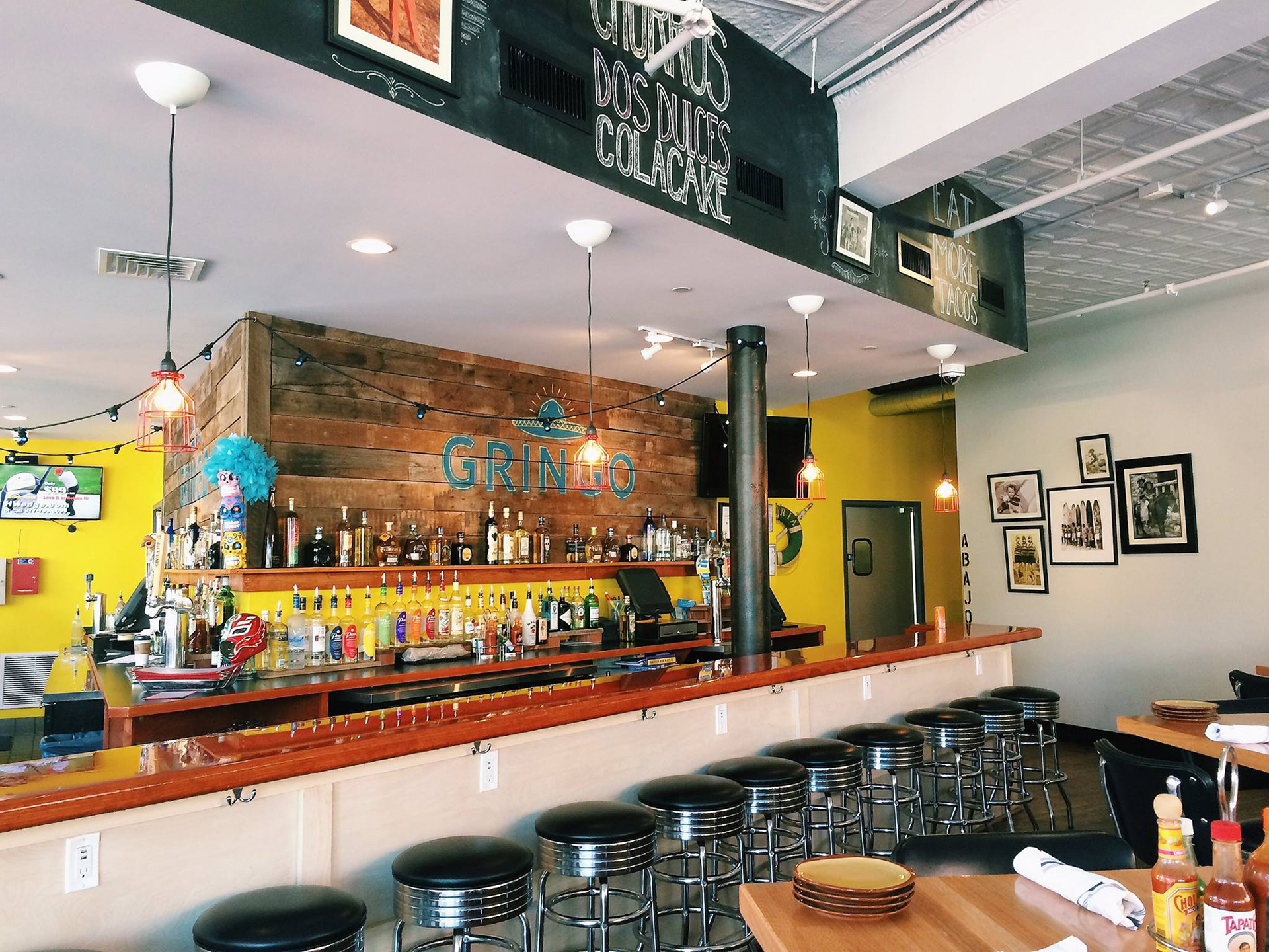
Gringo is a downtown St. Louis restaurant with a fresh take on tacos, tequila and cerveza. They wanted a brand that was playful and modern. It could borrow from the campy look of American Mexican restaurants, as long as it stopped short of kitsch.
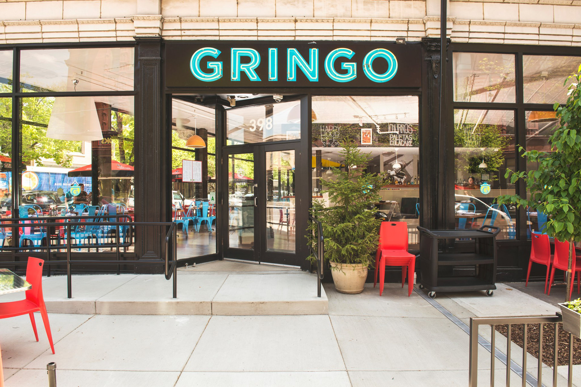
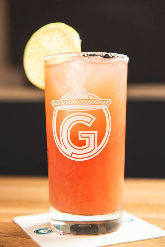
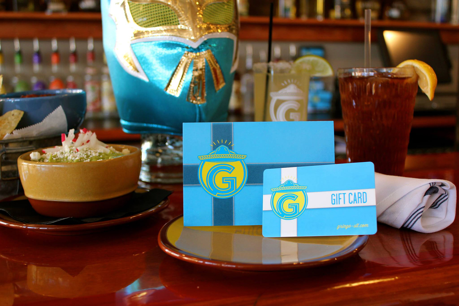
We drew a logo inspired by neon signs, with a sombrero illustration because every logo needs a hat. A standalone G icon handles the smaller spots around the restaurant. Later, Gringo turned the logo into a real neon sign for the wall. The food is great, and the space brings bright, warm energy to the neighborhood.
Britni Eggers, Karl Eggers
All work