
The identity and original packaging that helped a St. Louis coffee roaster launch.
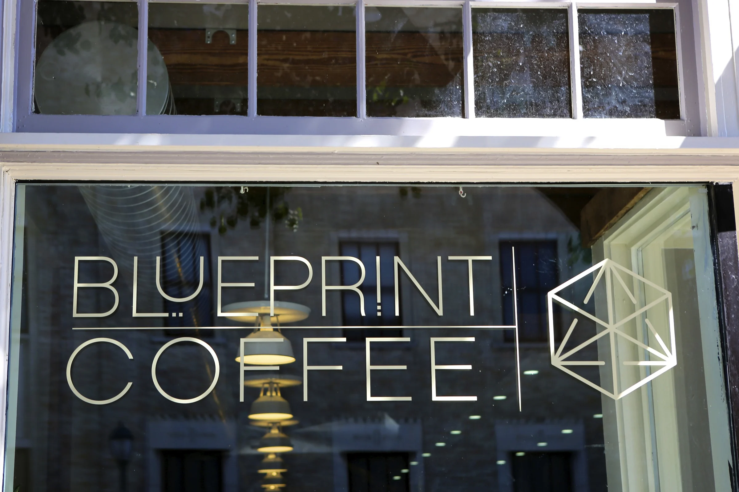
Blueprint Coffee is a roaster and cafe in St. Louis. Karl designed the identity and the first packaging, and both launched when the cafe opened in September 2013.
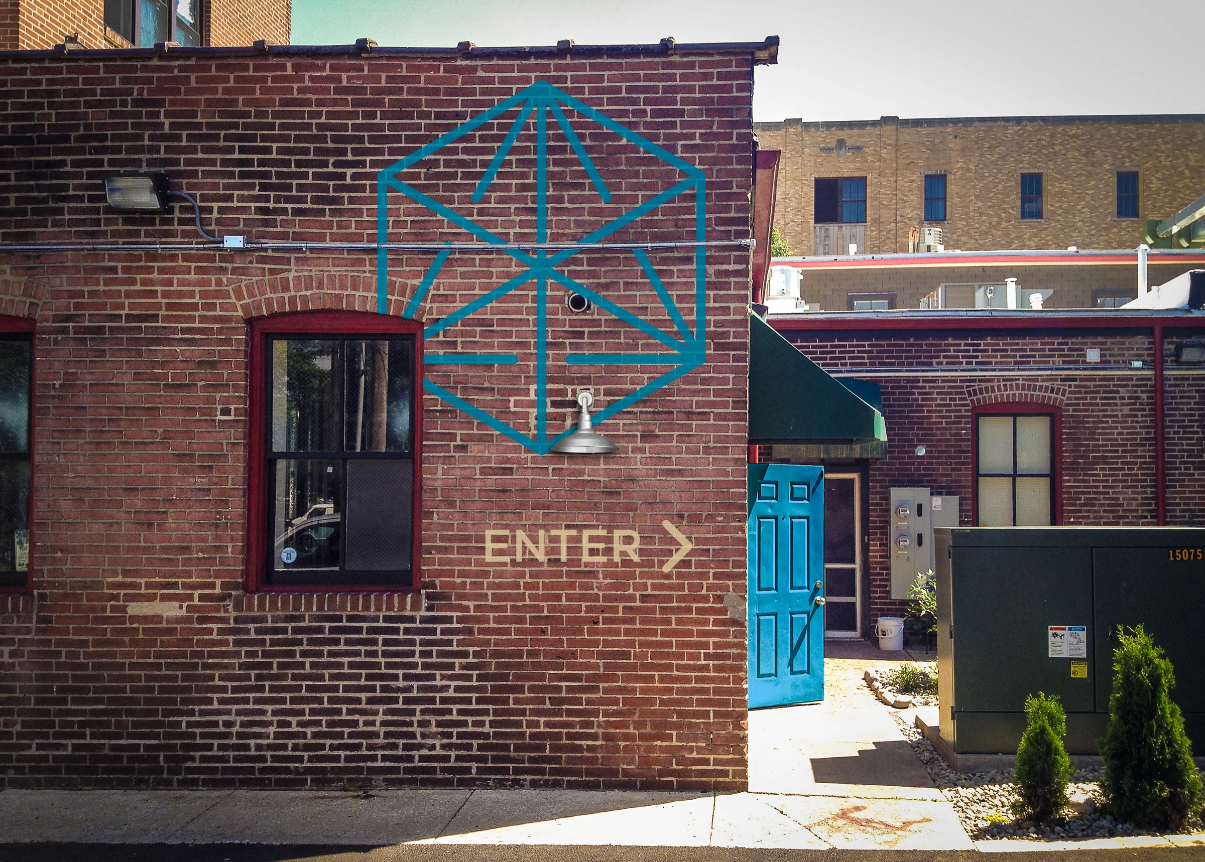
The mark is a cube drawn as a line diagram, like something lifted from a drafting table. It sits beside a thin, open wordmark, and it suits the name.
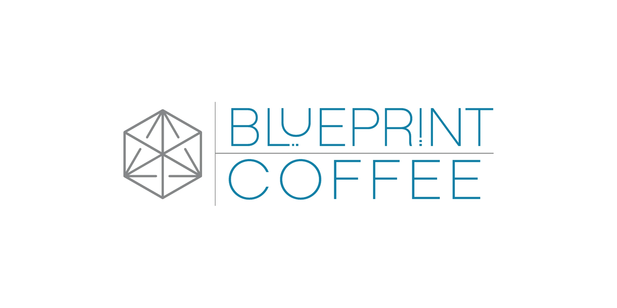
The logo works in one color, and it takes color well. Karl built a wide palette so the mark could change color and still read as Blueprint.
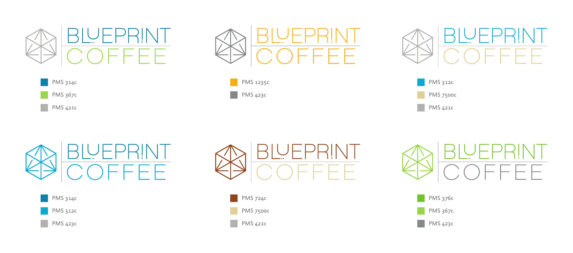
Each coffee got its own label on a shared layout. Blue across the top carries the logo. Below it, a band of color names the coffee and tells you what to expect in the cup. Brown means caramel and chocolate. Yellow means floral and citrus. Red means juicy red fruit.
A cube-shaped chart shows body, brightness and sweetness at a glance. Blank fields leave room for the roast date, batch and size.
The labels went on matte white, foil-lined bags, so the label carried all the color on the shelf.
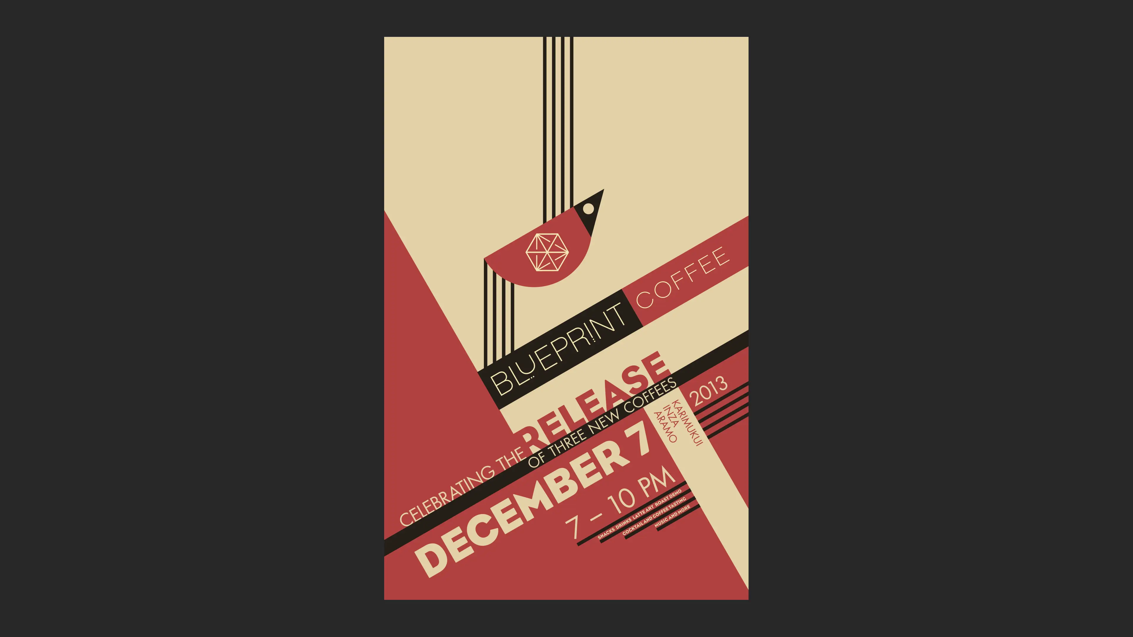
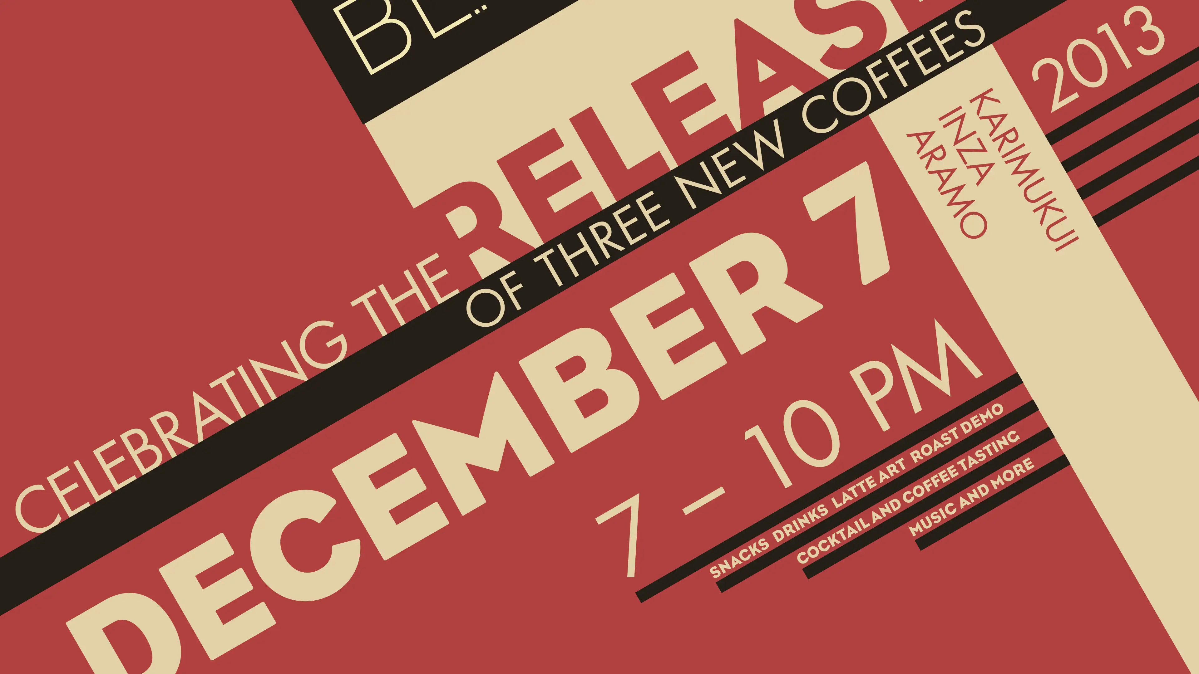
Later that year, Blueprint released three new coffees and asked Karl for a Bauhaus-themed poster and a bag label for the party. It was a treat to play with such classic design iconography.


Karl Eggers
All work